
The rule of thirds is an element of design that is commonly referenced in the scope of photography. This rule is based off of using a grid (whether mental or on the display of a camera) in order to place the objects of interest in a photograph within either parameters of the grid or on the lines of the grid. Using the rule of thirds grid, an image is separated into three equal parts both vertically and horizontally. The intended subject of the photograph is subsequently placed either on one of the lines of the grid or within a column or row that is formed by the grid lines. By doing so, the eye of the viewer is drawn towards whichever element has been placed within the parameters of the grid. Below I have compiled a variety of examples of the rule of thirds being used. To emphasize this element of design, I have included the grid on the images.
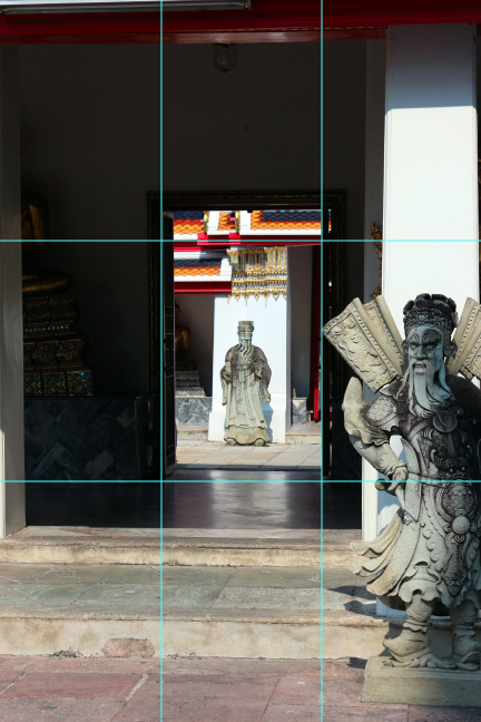

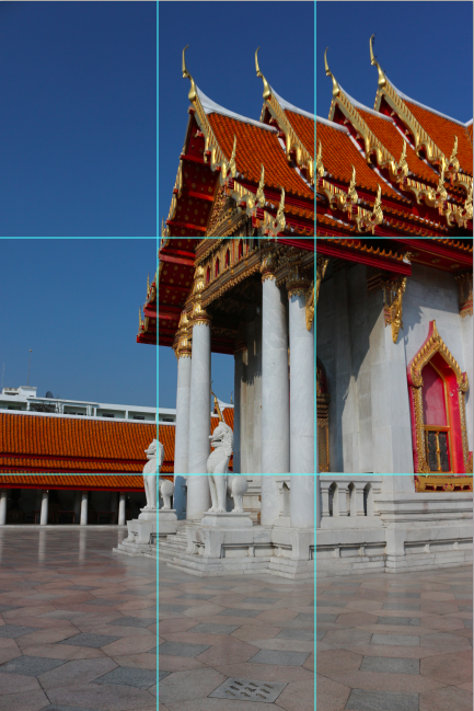 I’m sure that you can see a recurring theme here. While it doesn’t have to stick to the grid precisely, the general point of the rule of thirds is to have an asymmetrical balance to the photograph. The rule can be used to draw attention to a subject or element that the photographer wants to highlight.